Creative partner for
brands and agencies.
Thoughtful design.
Bold ideas.
BDC
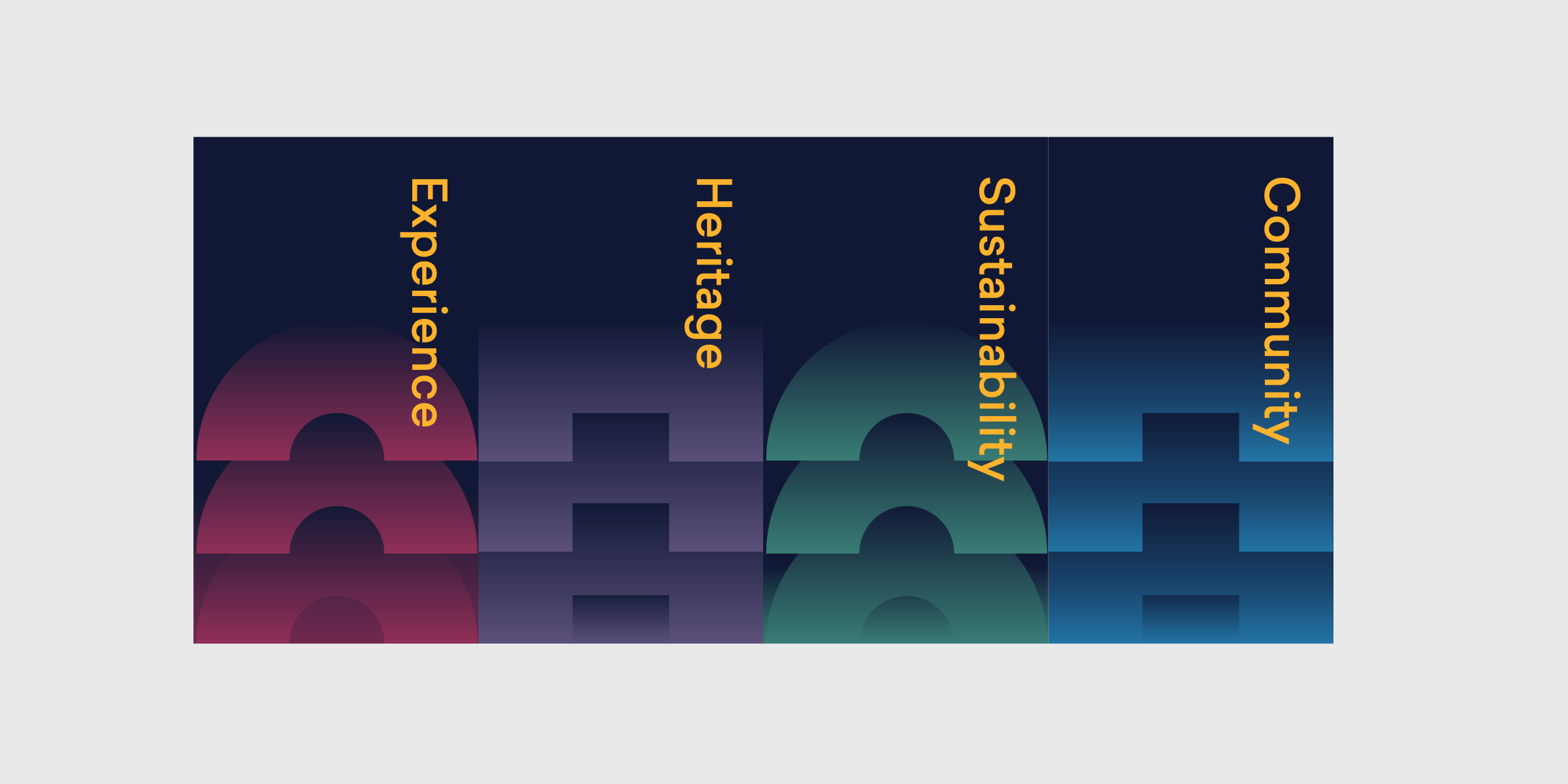
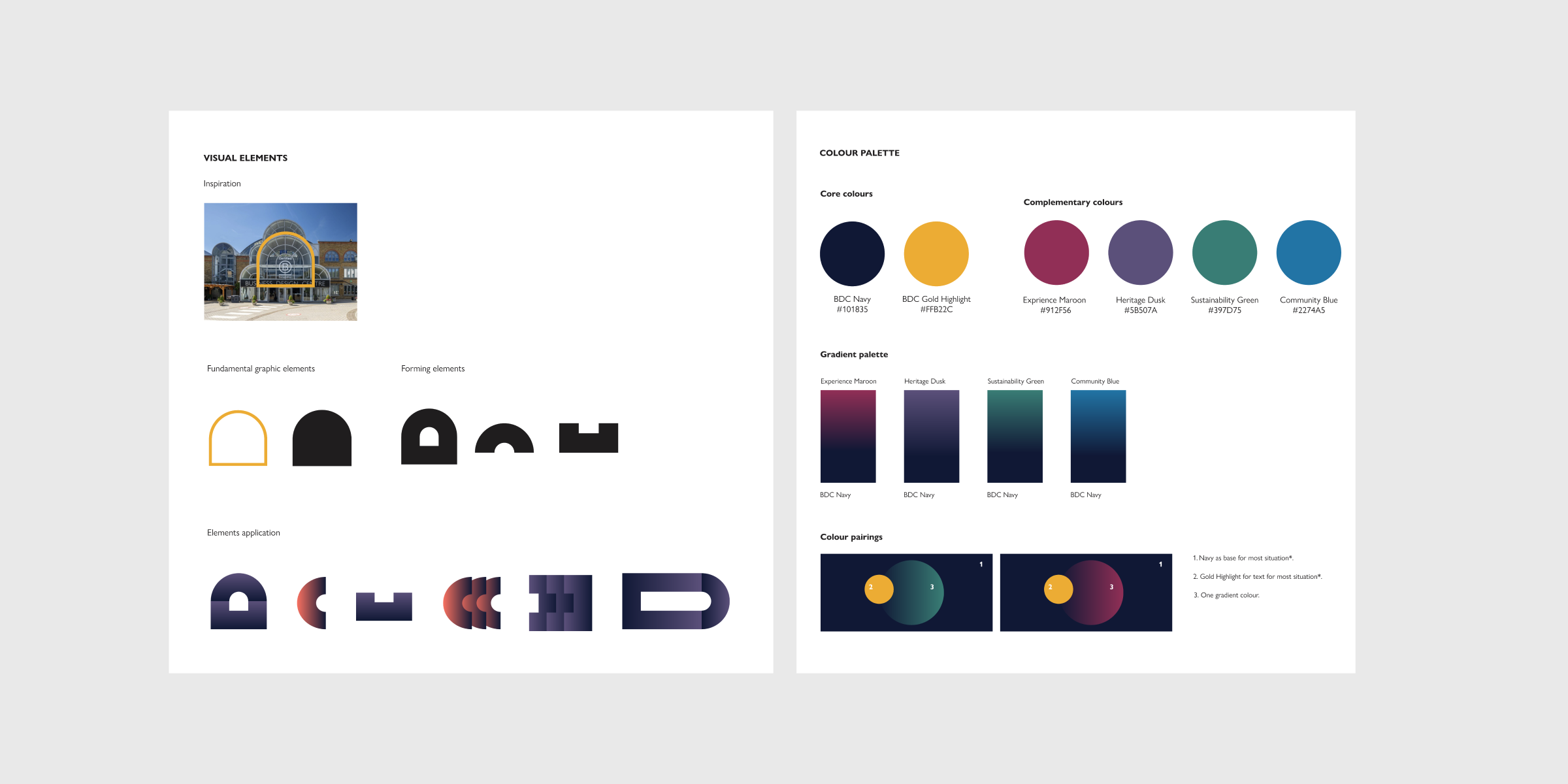
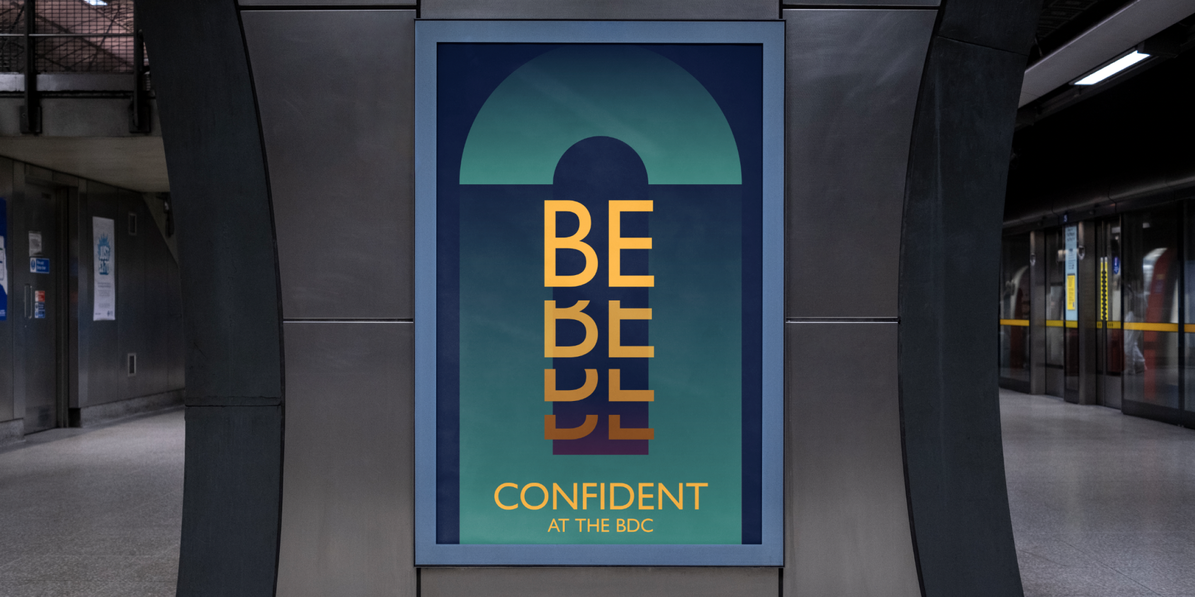
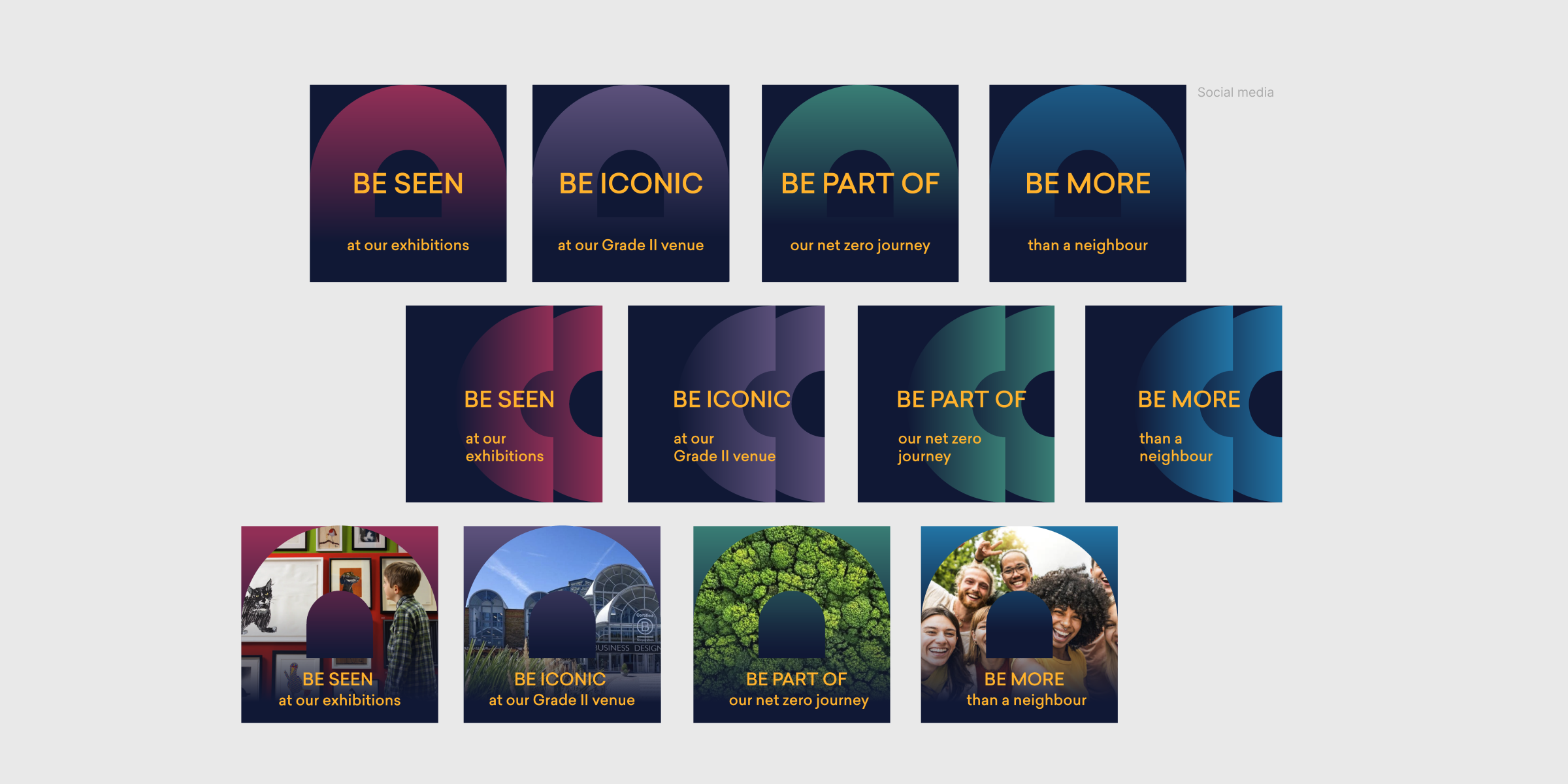
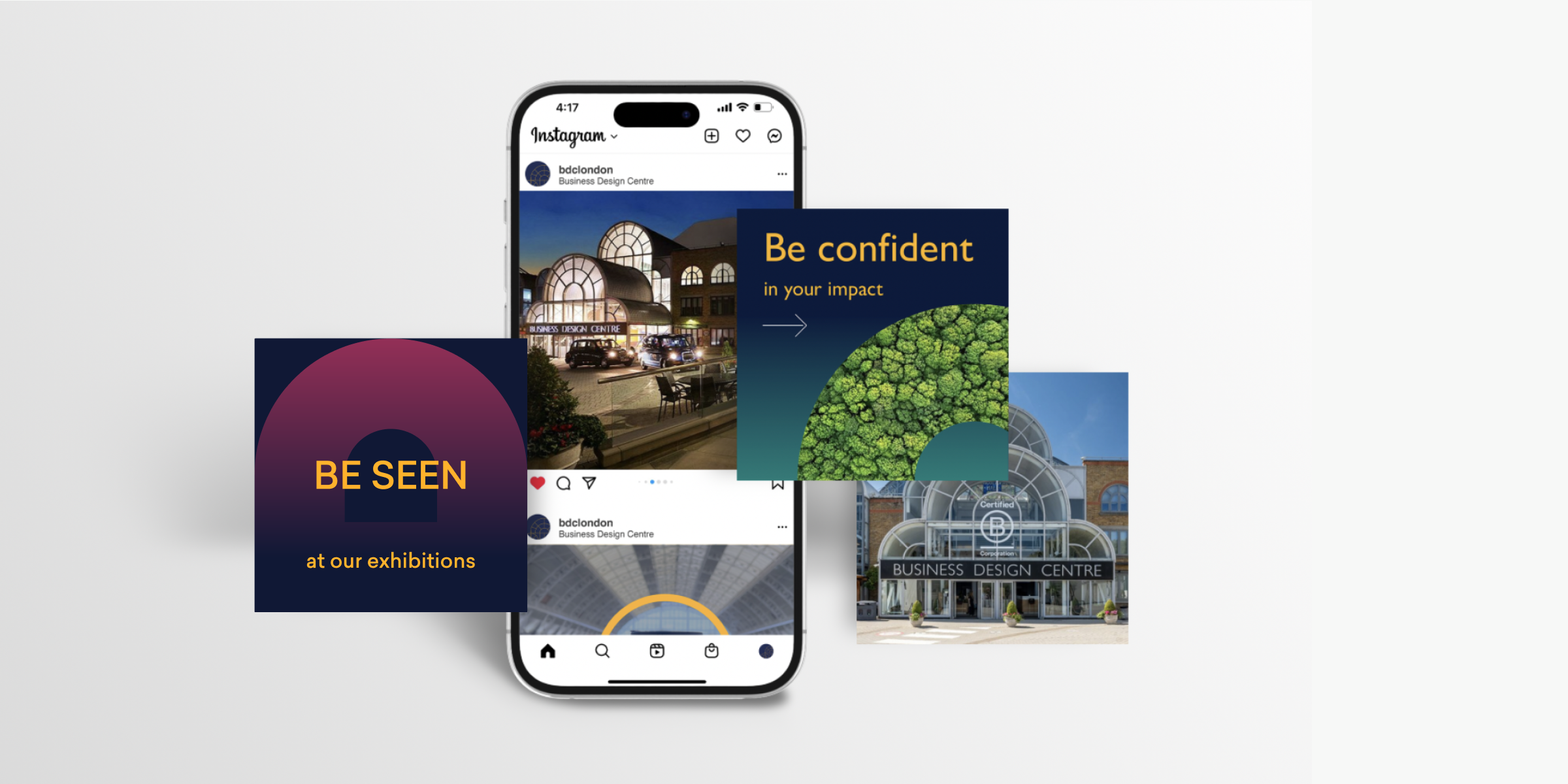
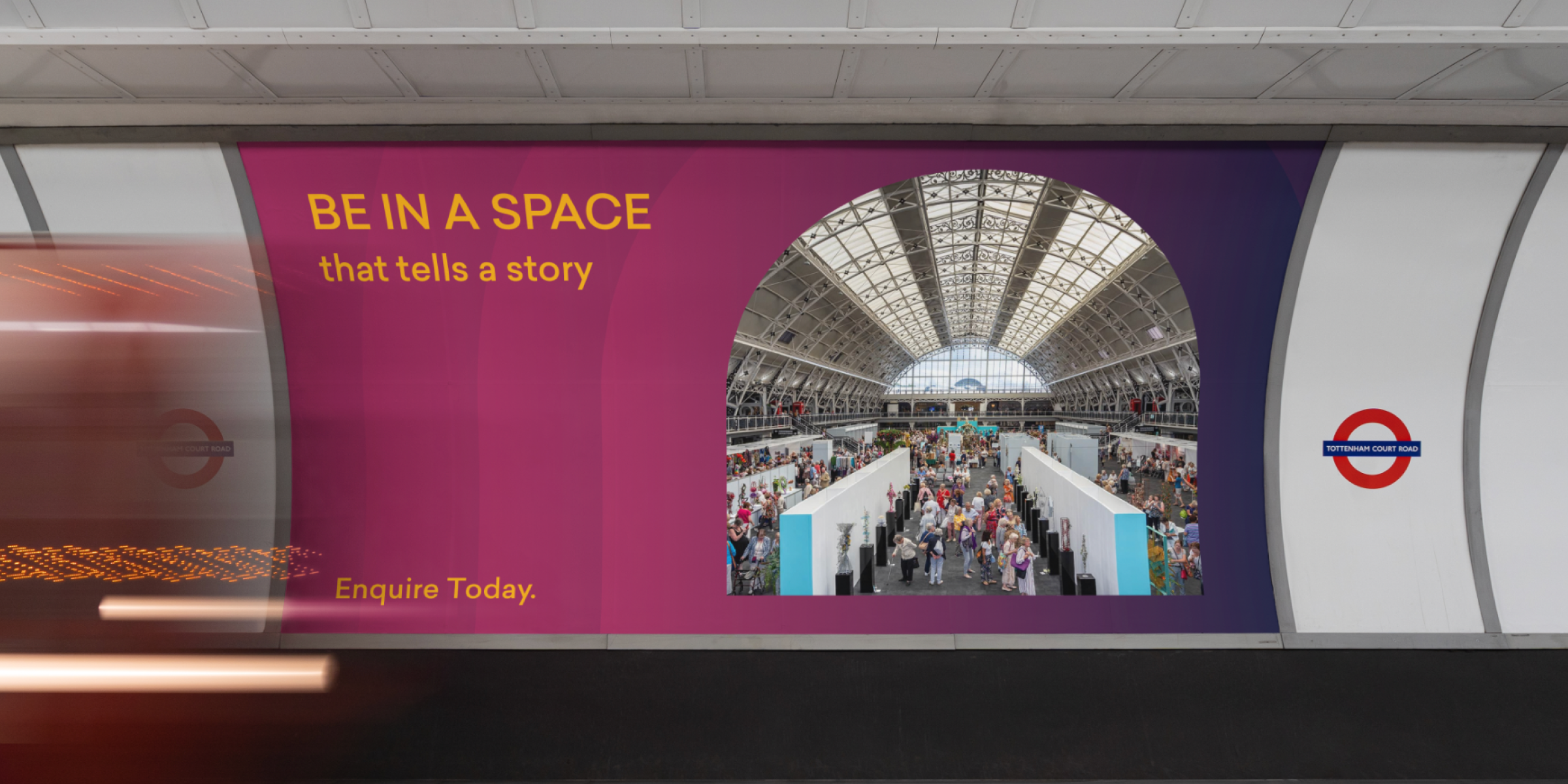
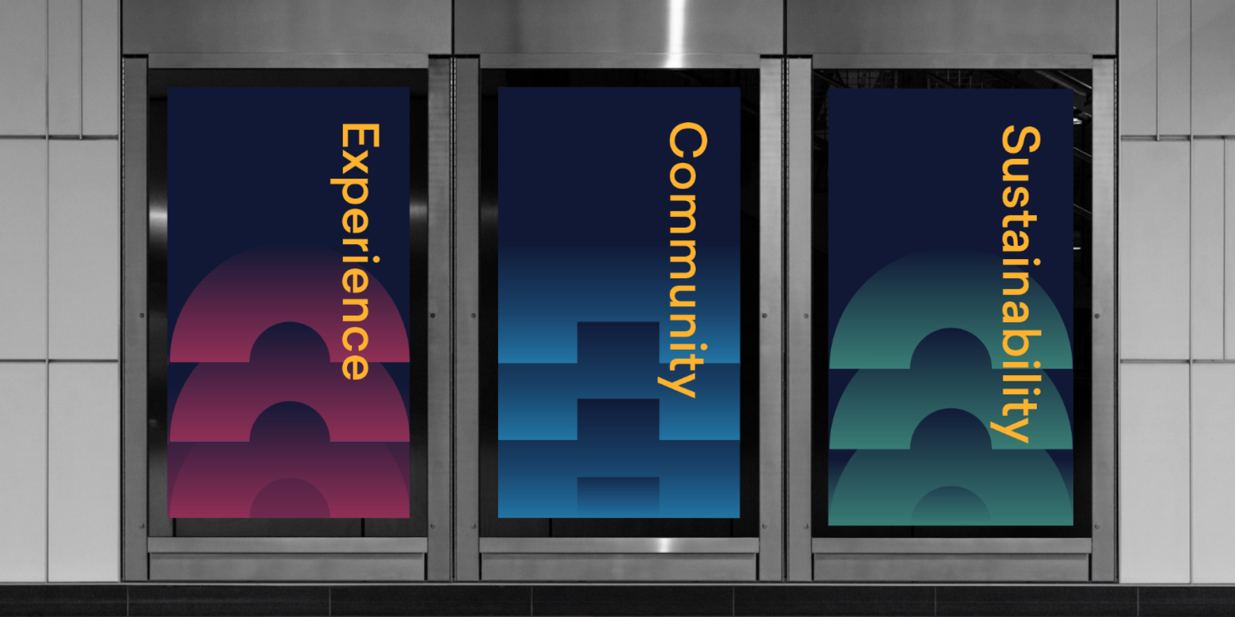
The rebranding of the Business Design Centre (BDC) sought to modernise its visual identity while honouring its heritage. This new identity, grounded in BDC's core values, utilised four pillars—Experience, Design & Heritage, Sustainability, and Community—to guide design decisions. The architectural arch, inspired by the BDC building, served as a key visual motif across design assets. A new color palette of navy, gold, maroon, dusk, green, and blue improved visual communication and highlighted messages of urgency and sustainability. The "Be" Campaign highlighted the four pillars of community engagement, sustainability, and inspiration, utilising a bold colour scheme to invite participation and enhance community connection. BDC's new visual identity enhanced its market presence and engagement, receiving positive feedback for effectively communicating its story and goals in supporting community and innovation in the creative sector.
Art direction
Visual Identity
Campaign
Marketing Design


Related cases
Here's a few more cases that you might find relevant to dive into as well.