Creative partner for
brands and agencies.
Thoughtful design.
Bold ideas.
Aerox
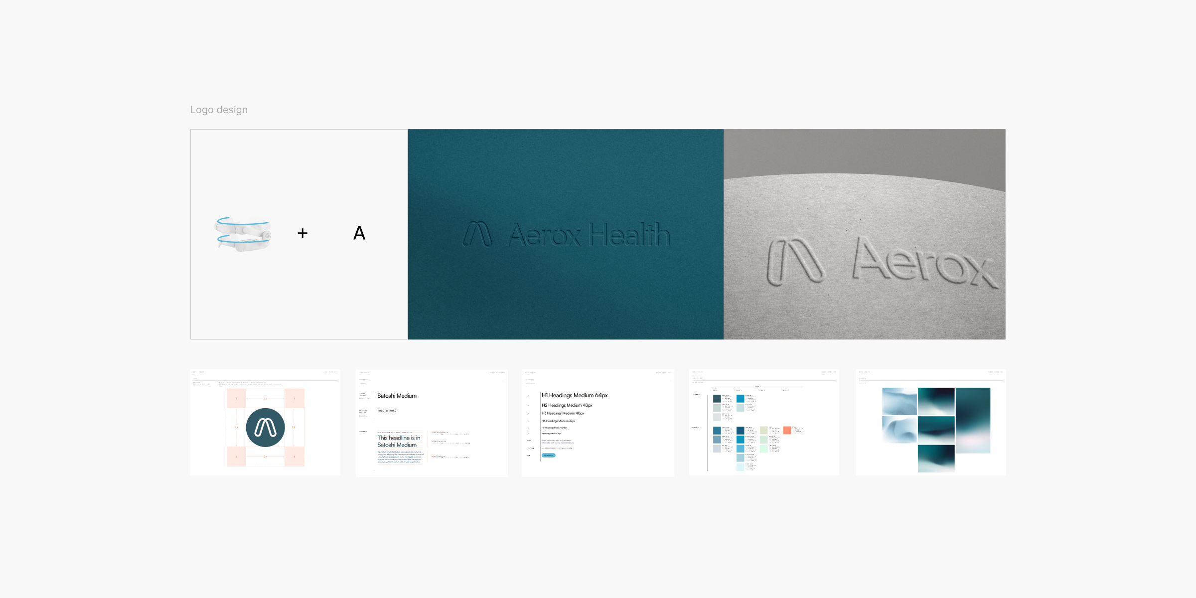
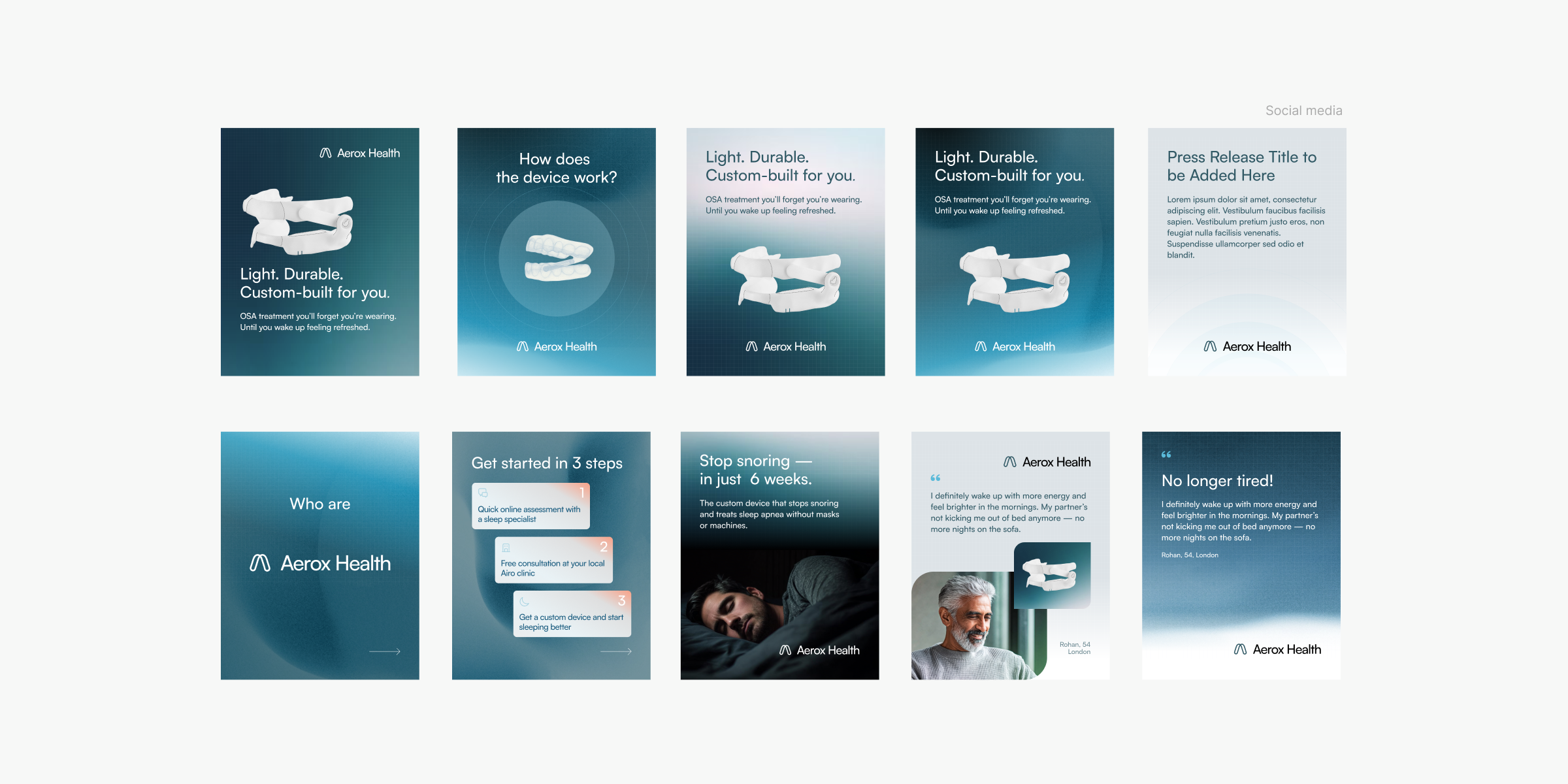
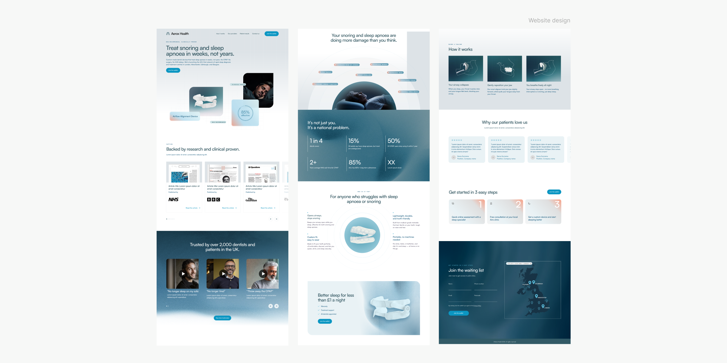
Aerox Health aims to transform healthcare by enhancing wellness and accessibility. A rebranding initiative was launched to better reflect the company’s values and goals. The previous brand identity lacked clarity and didn't fully represent the company’s mission. The goal was to create a modern brand that resonates with both healthcare professionals and consumers while maintaining the essence of Aerox Health. The new logo features a clean, sans-serif font and a stylized "A" symbolizing health and growth, representing the core product and the company's commitment to dynamic health solutions. The refreshed visual identity includes a color palette of blue, green, and white, representing health and tranquility. Custom illustrations were created to enhance storytelling across platforms. The redesigned website focuses on user experience with intuitive navigation, featuring engaging banners and clear calls to action. The rebranding successfully positions Aerox Health as a leader in innovative health solutions, establishing a strong identity and supporting its mission to enhance wellness and accessibility in healthcare.
Branding & logo
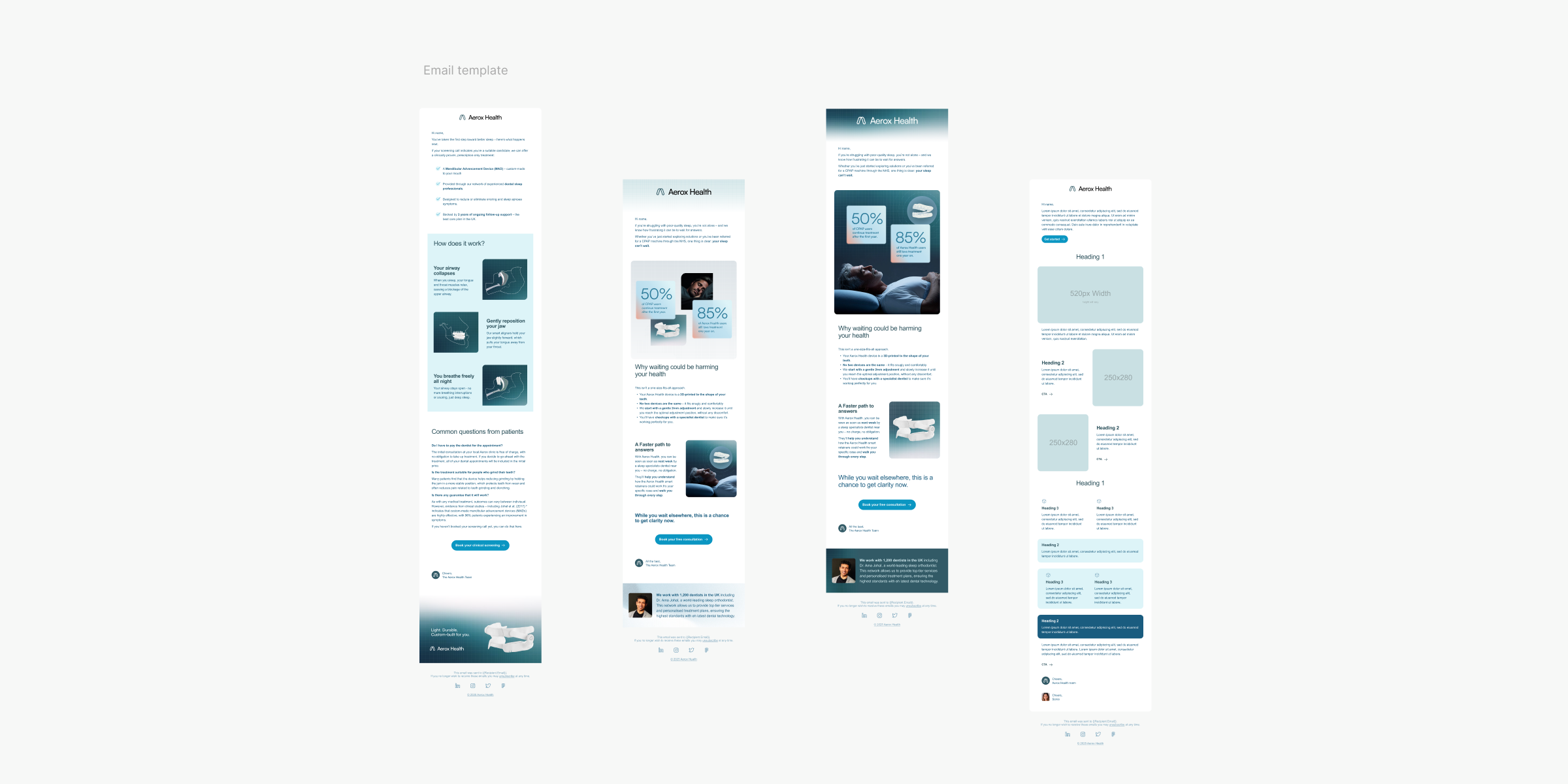
Visual identity Design
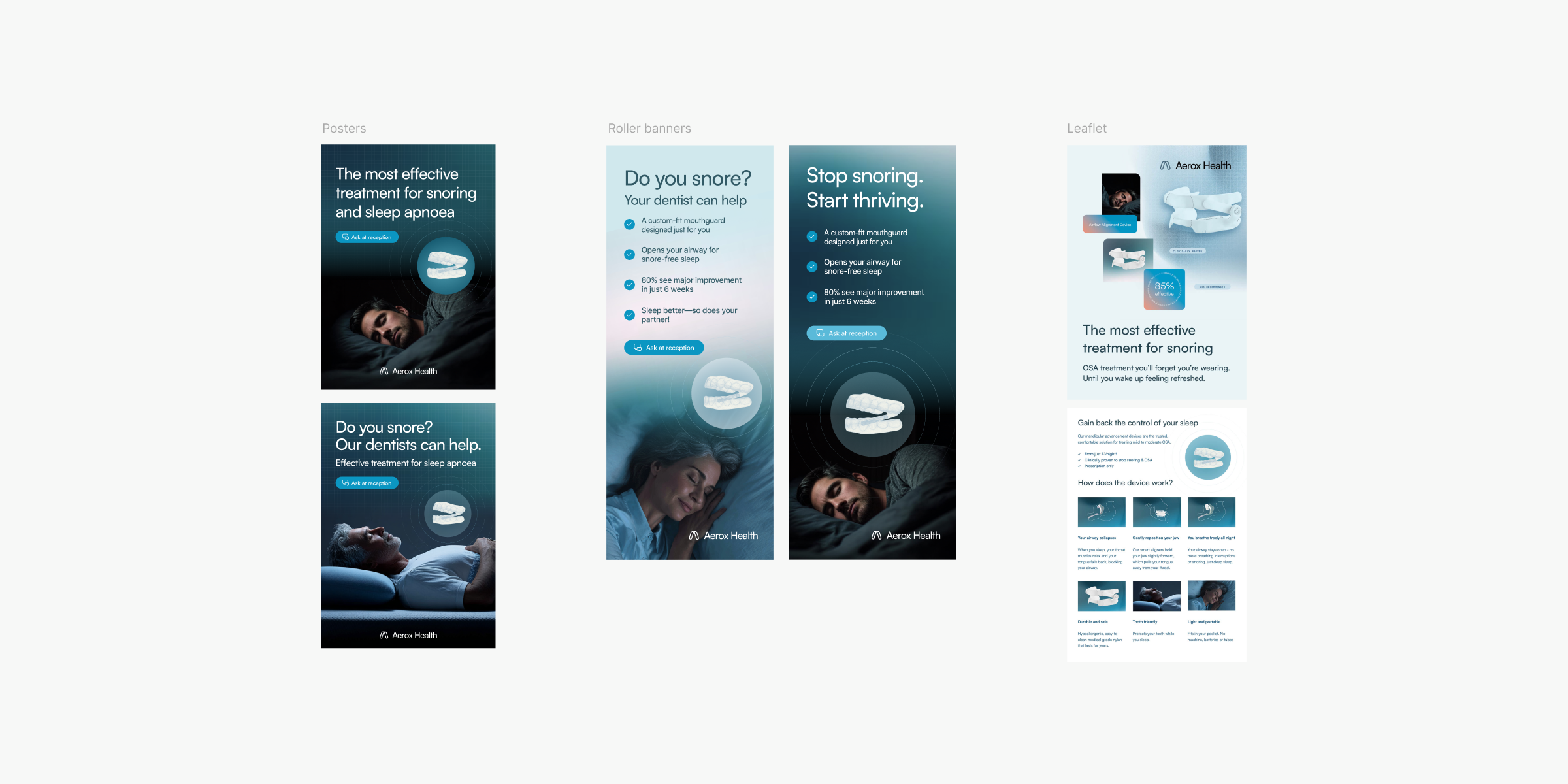
Brand activation & Print
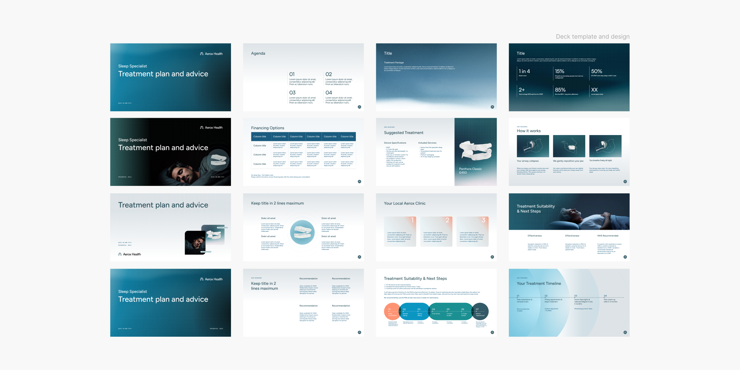
Marketing and branded collaterals
Web & digital design

Related cases
Here's a few more cases that you might find relevant to dive into as well.